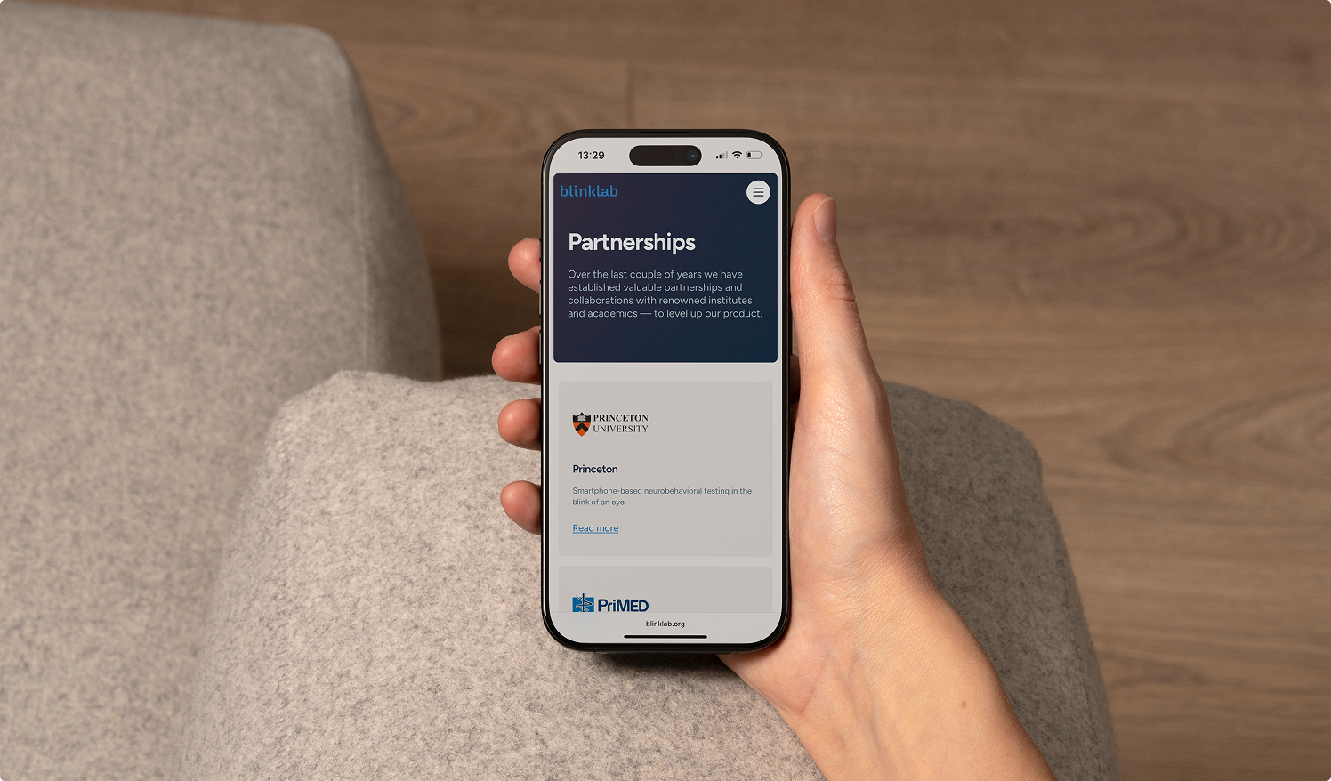
Building BlinkLab's digital platform for its next $17.5M growth phase
See how Overflow Agency helped BlinkLab build a stronger B2B website and scalable digital growth system.
About BlinkLab
BlinkLab Ltd is a medtech company founded in 2021 as a spin-off from Princeton University by a team of neuroscientists. The company develops AI-powered diagnostic technology for neurodevelopmental conditions such as autism spectrum disorder (ASD) and ADHD.
Its technology uses a smartphone to measure responses to sensory stimuli, with the goal of making neurological assessments more accessible and scalable.
In 2024, BlinkLab listed on the Australian Securities Exchange under ASX: BB1. As the company entered its next stage of growth, its website needed to evolve with it.
The Challenge
One company. Three very different definitions of trust.
BlinkLab had evolved faster than its website.
Following its ASX listing, the website was no longer simply a place to explain its technology. It had become a due-diligence touchpoint for investors, a scientific resource for researchers and clinicians, and an introduction to BlinkLab for families trying to understand what the technology could mean for them.
Each audience evaluated the company differently.
Families needed clarity. They had to understand a complex technology without being overwhelmed by scientific terminology.
Researchers and clinicians needed depth. They wanted access to the methodology, research and scientific evidence behind BlinkLab's technology.
Investors needed confidence. They needed to quickly understand the company, its progress, commercial potential and latest developments.
The existing website wasn't structured around those different needs. Scientific information dominated the experience, important corporate information was harder to navigate, and visitors with different intentions were largely expected to follow the same journey.
BlinkLab didn't simply need a redesign.
It needed one digital platform capable of building trust with three audiences that evaluate credibility in completely different ways.
The Solution
Designing three paths to trust within one website
Overflow worked with BlinkLab across strategy, information architecture, UX, web design and Webflow development.
Instead of treating the project as a visual redesign, we started with the audiences BlinkLab needed to convince and the information each of them needed before taking a next step.
That became the foundation for the new website.
01. Designing around three audience journeys
We reorganised BlinkLab's information architecture around the needs of families, researchers and investors.
Rather than forcing every visitor through the same company story, the website progressively directs people towards the level and type of information relevant to them.
For families, the journey prioritises understanding: what BlinkLab does, why it matters and how the technology works.
For researchers and clinicians, the journey provides greater scientific depth through research, methodology and supporting evidence.
For investors, the website makes company information, developments, research and investor materials easier to discover and evaluate.
The result is one consistent BlinkLab brand with different paths to the information each stakeholder needs.
02. Making complex science easier to understand
BlinkLab operates in a field where simplifying the message too much can undermine scientific credibility, while explaining everything in scientific language makes the technology inaccessible to a broader audience.
The solution wasn't to remove complexity. It was to structure it.
We created a clearer content and visual hierarchy that communicates BlinkLab's core proposition first, while making deeper scientific information available for visitors who need it.
Families and investors can understand the significance of the technology without reading a scientific paper. Researchers and clinicians can still access the evidence and depth required to evaluate it seriously.
This allowed BlinkLab to make its technology more understandable without diluting the science behind it.
03. Turning the website into investor infrastructure
Following BlinkLab's ASX listing, the website also had to function as part of the company's investor journey.
Prospective investors researching the company needed to move quickly from understanding what BlinkLab does to evaluating its progress and credibility.
We therefore gave investor-facing information a much clearer structure. Company developments, research, announcements and investor materials became easier to find, while the overall presentation was brought in line with the credibility expected from a publicly listed medtech company.
Instead of functioning primarily as a company brochure, the website became another layer of BlinkLab's investor communications.
04. Building a scalable publishing system in Webflow
A growing public company doesn't have a static website.
New research is published. Company announcements are released. Investor information changes. Clinical developments need to be communicated.
The website therefore had to be as easy to operate as it was to navigate.
We built BlinkLab's new website in Webflow using reusable components and structured CMS collections for recurring content such as research, announcements and investor updates.
This gives the BlinkLab team a consistent publishing system rather than a collection of individually designed pages.
New information can be added without rebuilding layouts or depending on a developer for routine website updates, allowing the website to evolve alongside the company.
05. Evolving the brand without losing recognition
BlinkLab already had a recognisable visual identity, so the objective wasn't to replace it.
We retained the company's established colours and core brand elements while developing a more mature digital design system around them.
Typography, layouts, components, imagery and interaction patterns were brought together into a more consistent system that could work across scientific content, corporate communications and accessible explanations of the product.
The result feels recognisably BlinkLab, but better reflects the company it has become.
From initial strategy and information architecture through UX, design and Webflow development, the complete website was delivered in seven weeks.
If your website has to convince more than one kind of stakeholder at once—investors, scientists, families, or otherwise—and getting that wrong carries real timing and funding consequences, this is the kind of problem we build for.

The Results
A website built for the company BlinkLab was becoming
The new website gave BlinkLab one credible digital platform for audiences that previously required very different stories.
Families can understand the purpose and potential of the technology more easily. Researchers and clinicians can access the scientific depth they need. Investors can quickly find the information required to understand and evaluate the company.
Internally, the website is also easier to operate. Research papers, company announcements and investor materials can be published through structured CMS collections while maintaining a consistent design across the site.
Most importantly, the website became an active part of BlinkLab's investor journey during an important period of growth.
Following the launch, BlinkLab saw a significant increase in qualified investor enquiries. The company subsequently raised $17.5 million in funding as it continued its next phase of growth.
The website didn't raise the capital. But it gave investors, researchers and other stakeholders a stronger digital environment in which to understand and evaluate the company behind it.
The bigger lesson
Different audiences don't require different brands. They require different paths to trust.
The BlinkLab project illustrates a challenge we see increasingly with complex B2B and technology companies.
As companies grow, so does the number of people their website needs to convince: customers, investors, technical buyers, researchers, partners, employees and other stakeholders.
The instinct is often to solve that complexity by adding more content.
But more information doesn't necessarily create more clarity.
The real challenge is deciding which information each audience needs, how much depth they require and when they need to see it.
BlinkLab didn't need separate websites for investors, researchers and families. It needed one clear digital platform with an information architecture capable of giving each audience the evidence they needed to trust the company.
That's the difference between a website that contains information and a B2B marketing website engineered around how people actually make decisions.